Accessibility
Main Landing Page
Guidelines
As articulated in the Rancho Santiago Community College District Mission Statement, our commitment to inclusion supports an environment where all students can achieve their educational goals. We strive to fully include all who engage with us by ensuring that communications and content are accessible to everyone. As a public institution that receives federal, state, and local funding, we are legally required to comply with federal laws known as the Americans with Disabilities Act (ADA) and the U.S. Rehabilitation Act of 1973. Accessibility has many components and covers a range of topics that are too vast to include here. For the purposes of this guide, we will focus on some of the most common accessibility-related issues for digital communications.
We encourage you to be mindful of accessibility across the entire range of media as communication trends, technology, and delivery platforms evolve.

Why It's Important
An estimated 13 percent of Americans – about 42 million people – have a disability. Inaccessible content excludes people just as much as steps prevent someone with a physical disability from entering a building. Inaccessible content denies them equal access to information, which many courts have ruled a violation of the Americans with Disabilities Act (ADA). The ADA can be complicated, but it’s intent and spirit – to ensure that those with disabilities have the same opportunities as everyone else – aligns with the Rancho Santiago Community College District mission of inclusivity.
Section 508 and ADA
Section 508 and ADA are terms that are often used interchangeably, but they are technically separate and unique. The ADA addresses accessibility in a broader sense, while Section 508 focuses on electronic content. Section 508 is a sub-section of the U.S. Rehabilitation Act of 1973 that requires electronic content to be accessible to people with disabilities. It also sets accessibility standards for websites and other digital communication tools and content, known as information communication technology. Section 508 was not part of the original Rehabilitation Act of 1973 but was added in 1998 to include accessibility requirements for all information technology.
Equal Access for Everyone
People with disabilities access digital content and navigate the web in a variety of ways:
- People who are blind or sight-impaired may use screen readers, which are devices that read aloud the text that appears on a screen, or screen magnifiers, both physical and software-based.
- People who are deaf or hard of hearing may rely on captions or transcripts. Videos should be captioned, and transcripts should accompany audio content. See Video & Audio below.
- People with mobility impairments may not be able to use a mouse, may rely on head pointers to interact with computers, or may require voice-recognition software to control their computers and devices with verbal commands.
- People with cognitive impairments experience a common set of functional issues that can be minimized by providing:
- Easily understood content using plain language.
- A clear focus on important content with minimal distractions.
- Logical, consistent design and layout of documents.
- Intuitive, consistent layout and navigation of websites and online content.
Accessibility isn't optional. It's a mandatory mindset and practice.
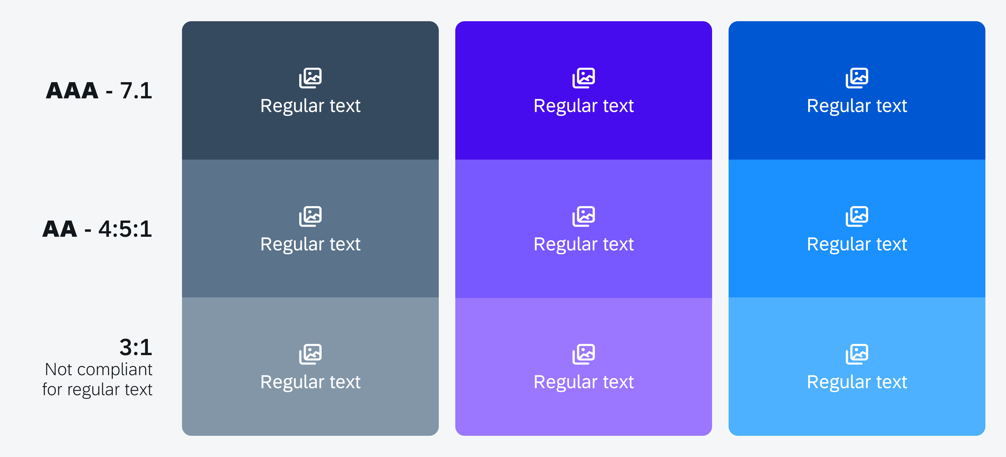
Color contrast is key to legibility and accessibility. Whether you’re creating a PDF, an event poster, or designing a webpage, it’s important to consider readability. Color combinations, reverse type, and type overlays can be challenging from an accessibility standpoint.
Contrast Ratio
Web Content Accessibility Guidelines (WCAG) require a contrast ratio of at least 4.5:1 for normal text and 3:1 for large text to achieve minimum compliance. Large text is defined as 14 point (typically 18.66px) and bold or larger, or 18 point (typically 24px) or larger.
Accessible Palettes
Color Safe provides accessible color palettes based on WCAG guidelines of text and background color ratios.
Checking Compliance
For websites and online media, use a web-based color contrast checker to check accessibility compliance. Color and link contrast checkers are available at no charge from WebAIM.
- Color Contrast Checker
- Link Contrast Checker
- Chrome Extension – The WCAG Color contrast checker is available as a free extension to the Chrome web browser. Visit the Chrome Web Store to install it.
TIP – Don’t use color as the only way to convey information. Use text or an icon as well.
All non-decorative images must be accompanied by a written description known as equivalent alternative text, more commonly referred to as alt text. Alt text is a description of an image that is read aloud to visually impaired users via a screen reader. Write alt text as if you were describing the visual scene of the image to someone over the phone. Tell them what you see, concisely.
General Guidelines
- Limit alt text to no more than 125 characters, or 250 characters for grouped images such as collages.
- Avoid filler words such as “this is a photo of.”
- If the image consists primarily of embedded text, that text should be used verbatim as the alt text.
- If an image is used to provide direction or guide the user (such as an arrow), the alt text should guide the user in the same direction.
Alt Text for Social Media
You can add alt text to images in social media posts using each platform’s edit or advanced settings feature. See instructions below.
Example

POOR: A student with her degree.
GOOD: A female student in cap and gown smiles while holding up her degree during the commencement
ceremony in the Honor Grove. Fellow graduates are seated behind her.
X (Twitter)
Follow these steps to enter alt text for images:
- Click the Post compose
- Attach your photo(s).
- Click Add description.
- Type your description of the image and click Done.
- Descriptions can be added for each image in a post.
Follow these steps to edit alt text for images:
- Click Photo/Video at the top of your Feed.
- Select the photo you want to add.
- Hover over the photo and click Edit.
- Click Alternative text in the menu on the left side.
- The automatically generated text will be shown on the left side of your photo. Click Override generated alt text to edit it.
- Write your alt text in the box. To change back to the automatically generated text, click Clear.
- Click Save at bottom left.
Follow these steps to edit alt text for images before you post:
- Upload an existing photo.
- Choose a filter and edit the image, then click Next.
- Click Accessibility, then write alt text in the box.
- Click Share to post.
Follow these steps to change the alt text of a photo after you post:
- Above your photo or video, click •••.
- Click Edit.
- Click Accessibility, then write the alt text in the box.
- Click Done to save changes.
Follow these steps to add or edit alt text for images:
- Uploading your image.
- Click text below image.
- Enter your alt text.
- Click Save.